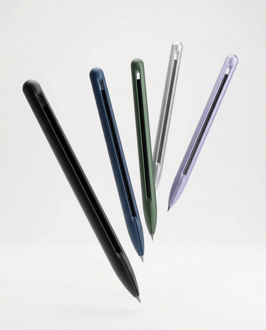

Less, but right.
How EVERLINE looks, sounds and feels – for retailers, press and partners. When in doubt: leave it out.
Logo
The wordmark is always lowercase. It stands alone – no frame, no tagline, no effects.
- Don't stretch
- Don't recolor
- No effects
- Don't rotate
Naming
- EVERLINE
- The brand in running text – always in caps.
- everline ONE
- The pen. “everline” lowercase, “ONE” in caps. Never “Everline One” or “EverLine”.
- everline BASE
- The stand. Same logic.
- everline ONE Titanium
- The titanium edition, in RAW, NEO and DLC finishes.
- Refills
- Graphite, color, ballpoint, Eternal – not “cartridges” or “inserts”.
Color
Brand colors stay quiet. Color comes from the product, not the layout. Tap to copy.
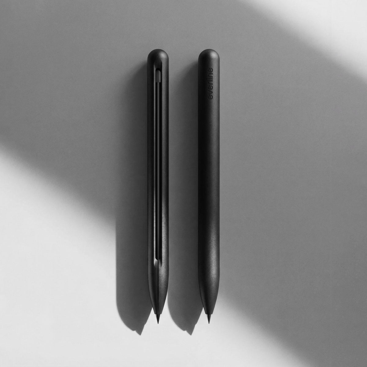
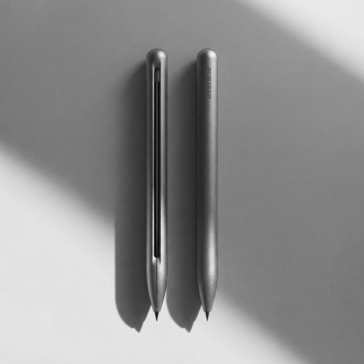
The seven finishes
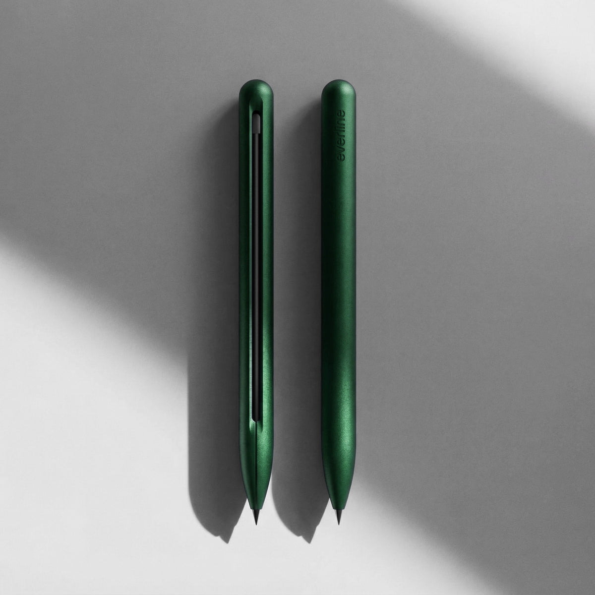
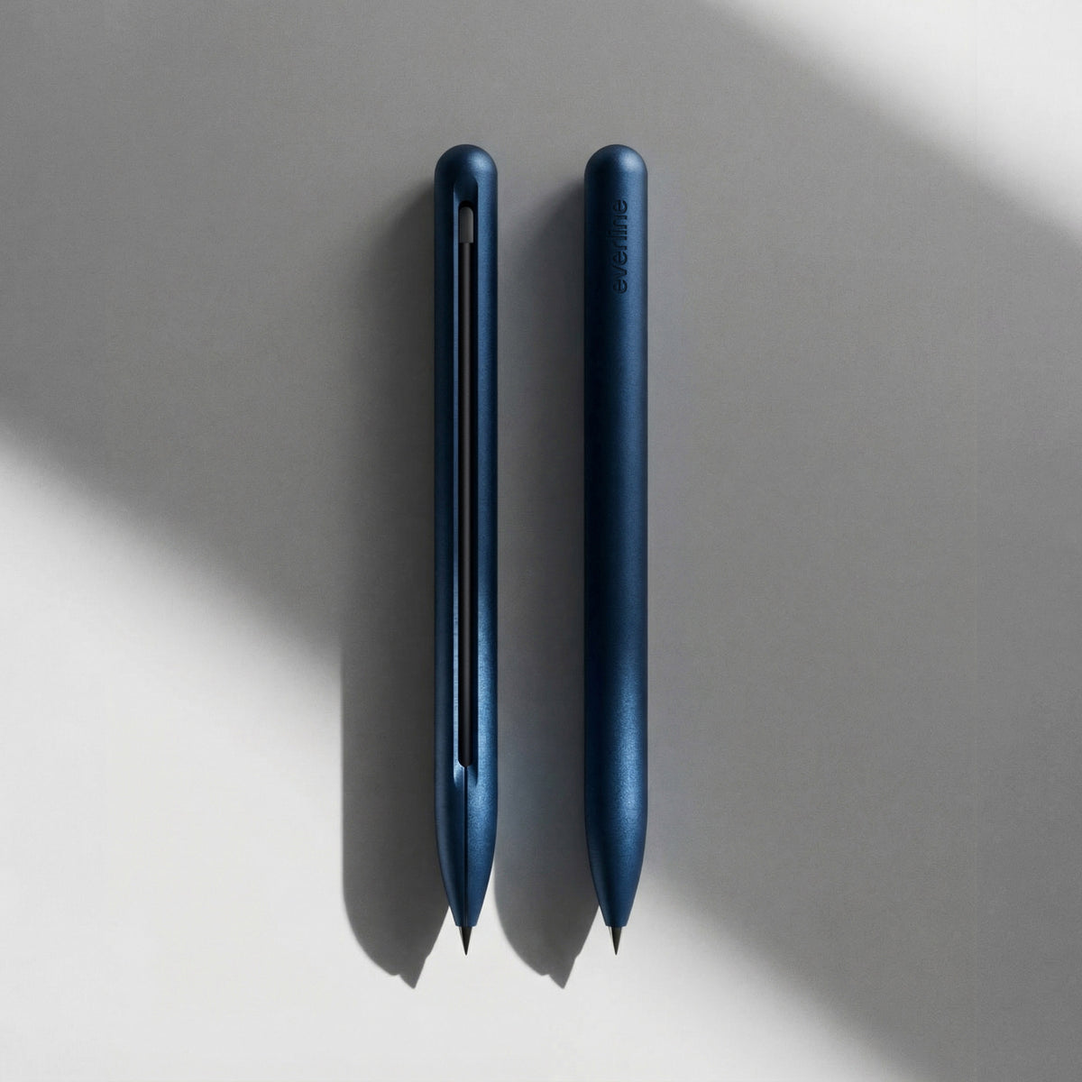
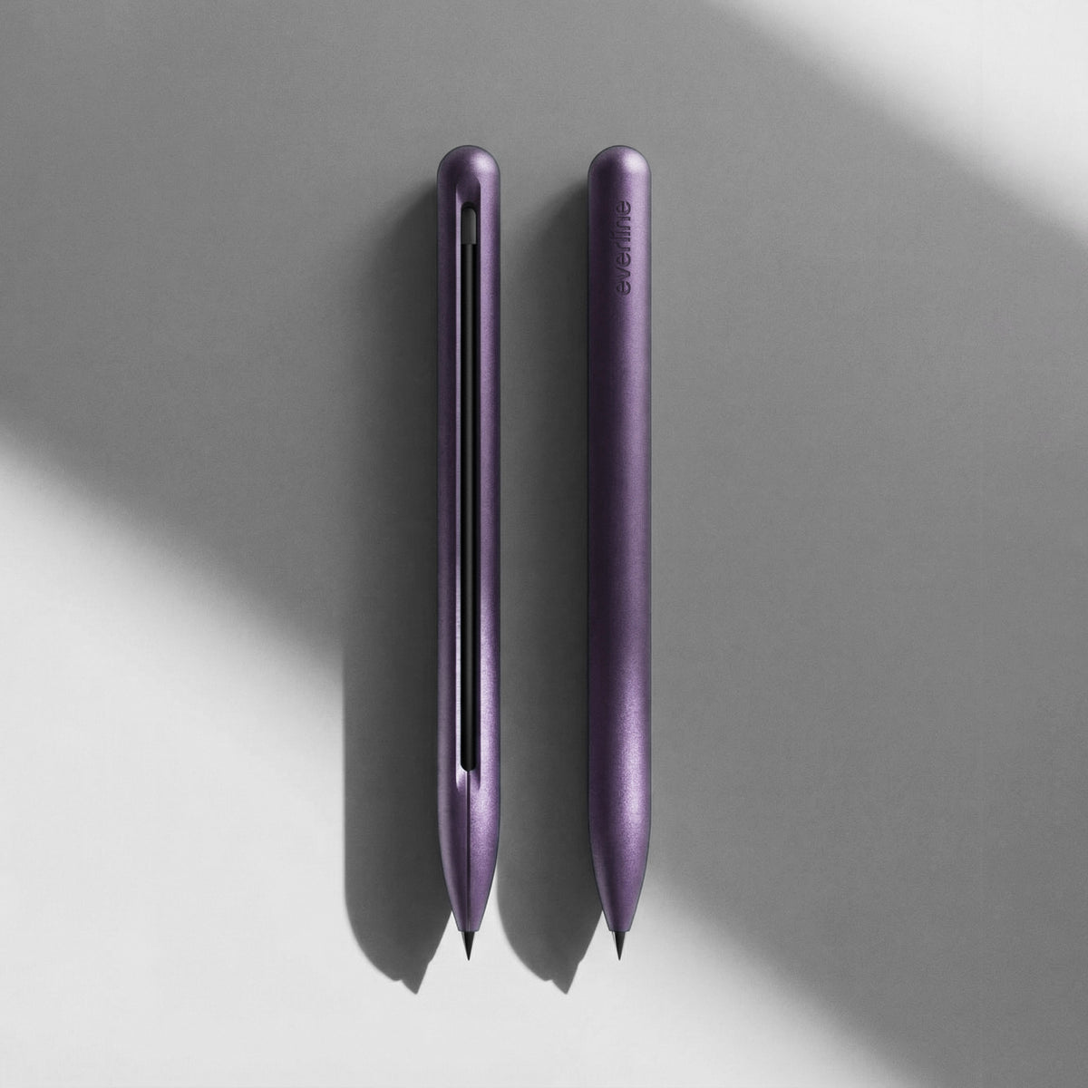
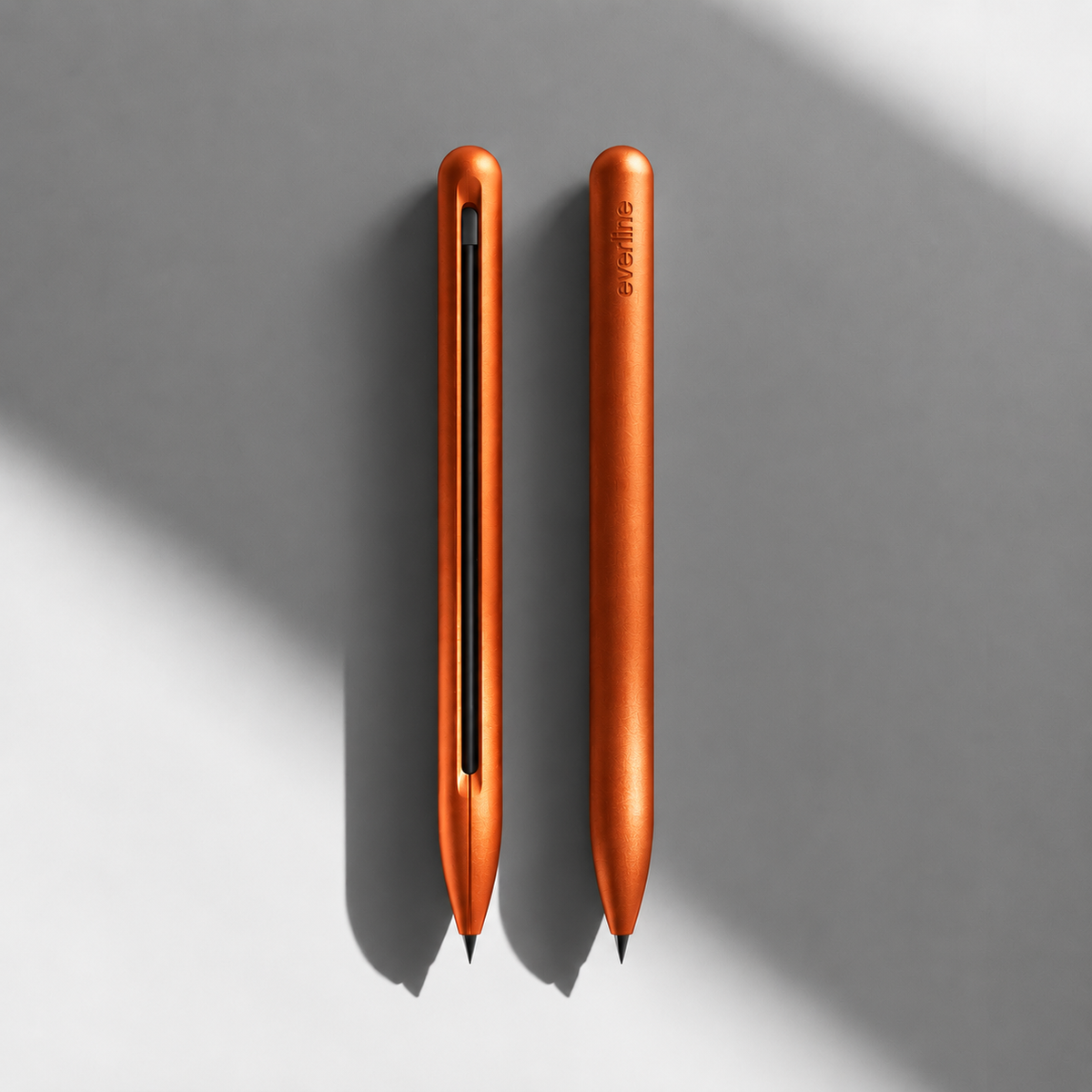
Typography
One family: Jost. Geometric, calm, legible – like the pen.
Headline · Bold · caps
Subhead · Semibold
Body · Regular 17 px · line height 1.55. One piece of aluminium. Four refills. Zero wear.
Eyebrow · Semibold · 13 px · +14 %
Voice
We talk the way the pen is built: direct, precise, nothing extra.
We say
- One pen. For good.
- No click. No cap. No spring.
- Machined, not molded.
We don't say
- “Exclusive”, “luxury”, “premium edition”
- “Revolutionary”, “world's best”
- “Indestructible”, “scratch-proof”
Imagery
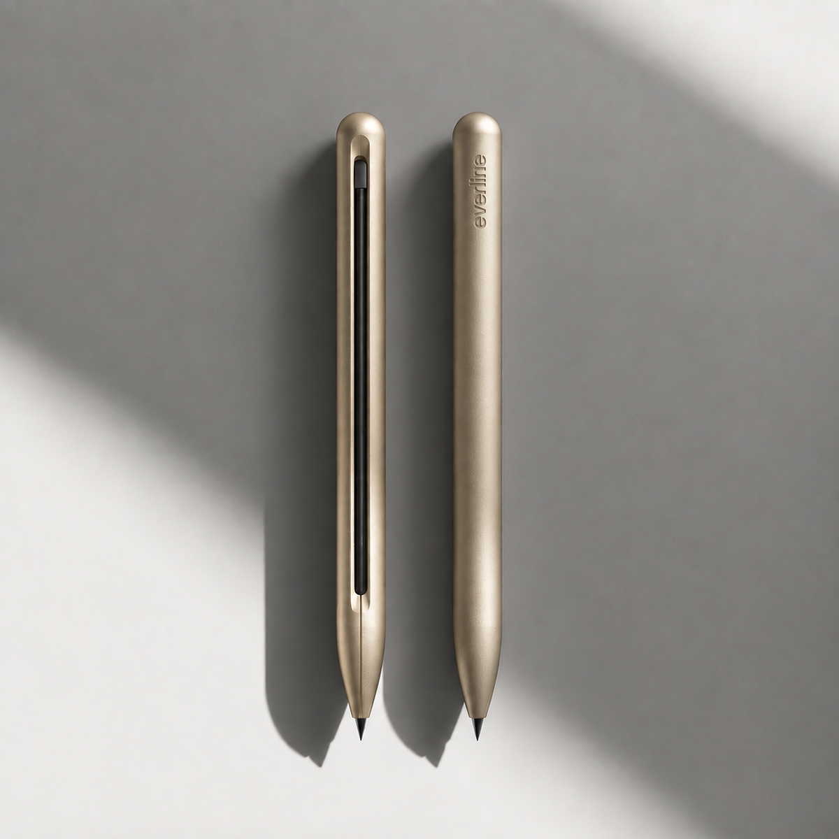
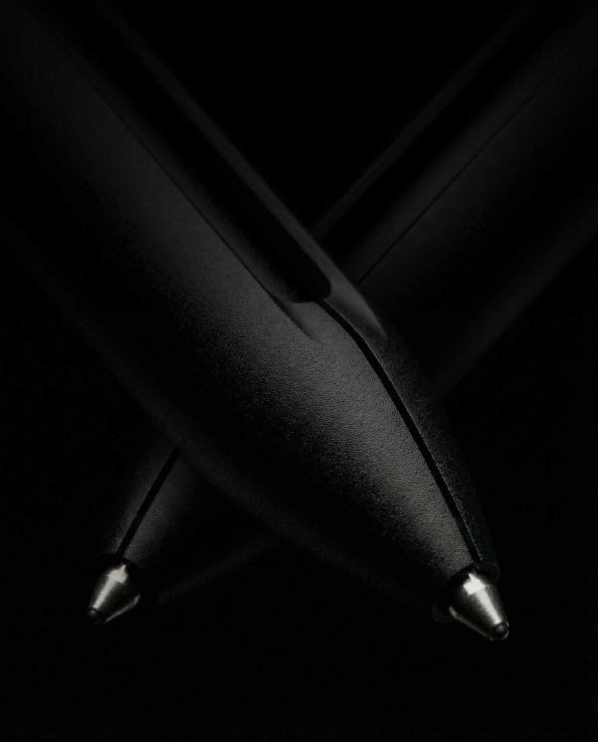
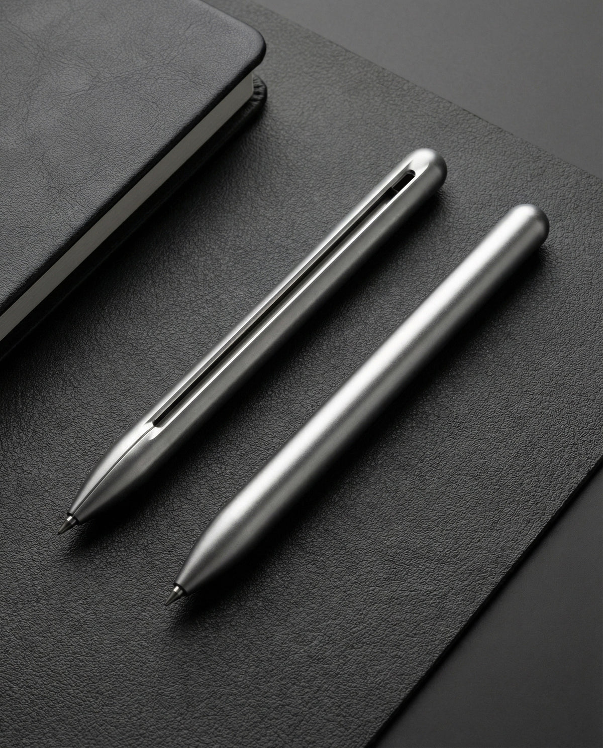
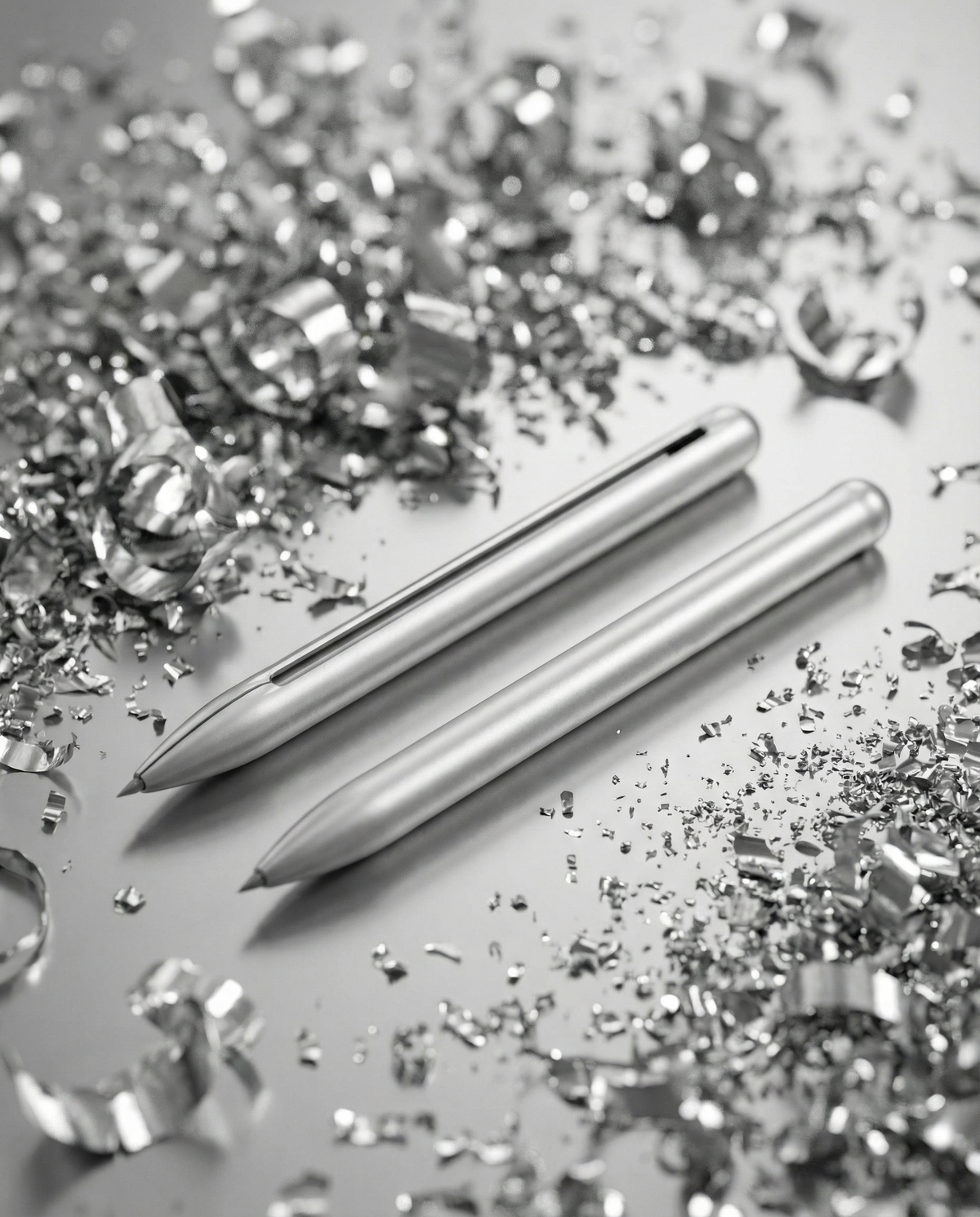
Calm, neutral surfaces. Natural light. Close enough to feel the material.
Product design language
Form follows function. The drawing is built from the original CAD splines of the everline ONE – we use the same lines for icons, catalog and illustrations.
Icons
Blueprint style: hairline, 45° hatching, round caps, 24 px grid. The pen icon is derived from the CAD splines.
Need print-ready logos & images?
Tell us what you need them for – we'll email you the package.
Retail partners buy at 50 % off RRP.